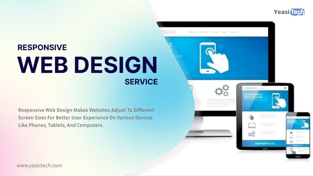
Responsive web design services refer to the ability of your website and its pages to adjust and provide consumers with the optimal experience on any device—desktop, laptop, tablet, or smartphone. However, a responsive design is necessary for it to occur on your website.
But what is a responsive web design, and how does it function? We will be discussing every detail relating to responsive web design services in this article.
Table of Contents
What are responsive web design services?
Responsive website design services refer to professional offerings provided by web development agencies or individual designers to create responsive websites. These services include website design and creation to provide the greatest possible user experience across a variety of devices and screen sizes. To give users a smooth and stylish experience on desktop, laptop, tablet, and smartphone platforms, the main objective is to modify a website’s look, performance, and content.
Flexible grids and layouts, flowing graphics, and media queries are examples of responsive design principles. The ability of webpage elements to adjust according to screen size is made possible by flexible grids. Sliding up or down without sacrificing quality or aspect ratio is possible with fluid images. Depending on particular device specs, such as screen width, media queries allow for the use of alternative stylesheets.
The advantages of responsive web design services
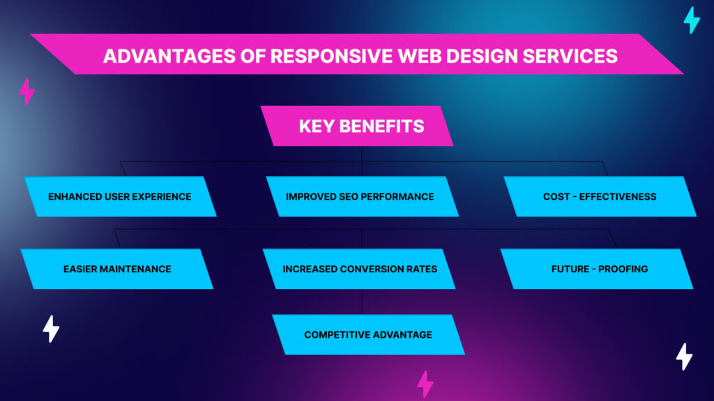
Let us discuss the benefits of responsive web design services, which are as follows:
- 1. Improved Brand Image: Consistent branding across all digital platforms and devices can boost sales by 33%. A website that is optimized for mobile devices displays your dedication to professional and user-centric design, improving the view and trust that visitors have in your business.
- 2. Affordable Approach: Keeping up with one adaptive website is less expensive than keeping separate versions for desktop and mobile devices. It lowers total costs by reducing content updates, maintenance, and development.
- 3. Future-Proofing: The responsive design can be used with a range of devices and screen sizes in the future. In the long term, you’ll save time and money by not having to redesign your website whenever a new gadget enters the market.
- 4. Better Conversion Rates: Because flexible-layout websites offer a dependable and user-friendly experience, they have higher conversion rates. According to 72% of marketers, websites with flexible designs have higher conversion rates.
- 5. Lower bounce rates: According to over 70% of designers, non-responsive design is the main reason why users quit a website. Therefore, by keeping users interested, a mobile-friendly design reduces bounce rates.
- 6. Better Organic Ranking: Mobile-friendly websites are given priority by search engines like Google. You may increase the possibility that your website will appear at the top of organic search results by employing a flexible design.
- 7. Adapting to Mobile Usage: Each day, everyone uses their smartphones for five to six hours. A responsive website is crucial given the increasing trend of smartphone usage. It meets the varied needs of your audience by taking into account the fact that users visit websites while on the go, giving a wider audience easy access to your content.
What is CSS?
Cascading Style Sheets is a stand-in for CSS. It is a language for style sheets that describes how a page or document written in a markup or coding language like HTML is presented. The way that HTML elements appear on a computer, piece of paper, or in another medium is specified by CSS.
How to Create Responsive Web Design Services in CSS
To start, let us clarify that creating a website is not a simple task and calls for a significant level of ability and knowledge. Designers have studied this craft for years, and we can hardly cover it all in one blog.
However we were able to put together a thorough three-step procedure that you may use to create a responsive web design with CSS serving as the markup language. Now let’s get started:
1. Layout
To begin with, we recommend doing things one step at a time while using the responsive web design services strategy. The layout should always come first when developing a responsive web design, whether starting from scratch or redesigning an existing page. If the material arrangement on a website is not appealing, up to 38% of users will stop browsing it. Thus, it is the most important thing to consider when designing.
Given the default size, you can always begin by designing a non-responsive layout. You can add media queries and make the necessary code changes to make the design responsive after you are satisfied with the non-responsive page’s layout.
Once the non-responsive website has been completed, copy and paste the following text between the tags on your HTML page:
<head> and </head>
And what does it result in? The default feature on smartphone browsers that shows webpages in full size and lets users pinch-zoom into the layout is gone and all screens are set to view in a 1 x 1 aspect ratio.
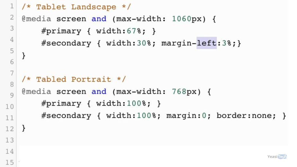
The media requests will now be added. We are unable to offer you ready-made codes since they are dependent on the layout of the individual website. The main content section is denoted by #primary, whereas the sidebar is denoted by #secondary. This code can be modified and customized to your specifications.
2. Medias
After you have finished your layout, we go on to add media, such as photographs and videos, which is an essential component of website design.
We’re intending to share a basic CSS code that should work on nearly every website. You may be ensured that your photos will never exceed the size of their parent container using this code. As stated differently, they will resize themselves to fit the screen size of the device they are on. That’s it—just paste this code into your CSS stylesheet.

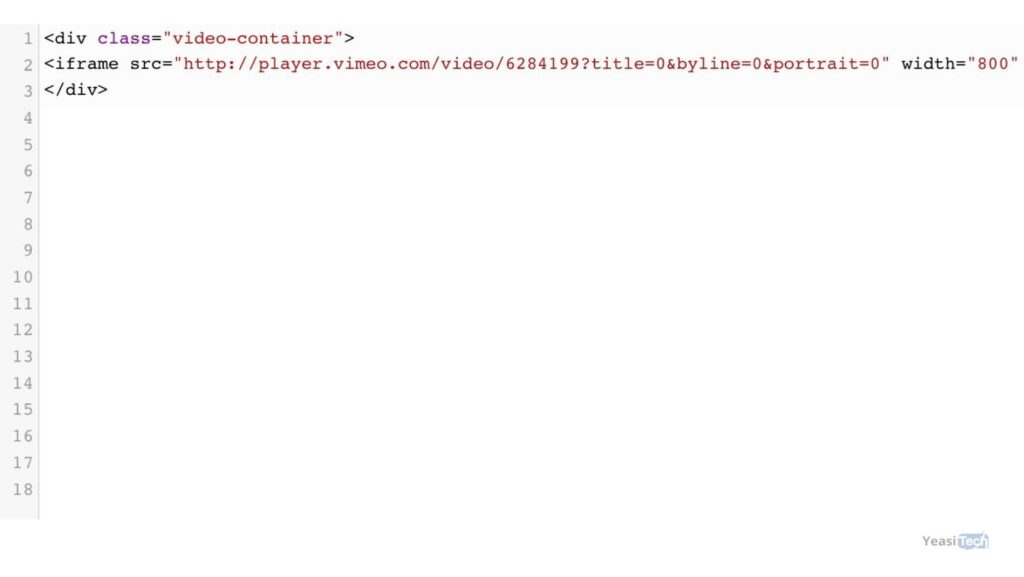
Now let’s talk about videos, which are another popular type of material on present websites. Most websites these days include videos from other websites or social media platforms. These channels can be found on Vimeo, YouTube, and other websites. With the code we’re going to give, you can make these embedded movies more responsive.

3. Typography
Another complex aspect of web design that designers frequently ignore is typography. We also advise approaching this module with focus. When it comes to typography, there are a few adjustments that must be made when switching from a non-responsive to a responsive website. Font sizes were previously defined by designers using pixels. Pixel operates well with a fixed-width dimension.
To adapt to the viewer’s screen, a responsive website requires a responsive style or a responsive web design template, both of which are connected to its parent container.
The rems unit was a new one introduced by CSS 3. They are linked to the HTML element, but they behave just like the EM unit. Rems is far more user-friendly than Ems because of this.
Expert Advice: Remember to change the HTML font size. You may now specify the responsive font dimensions, as seen below:
{ font-size:100%; }
Finally, because outdated browsers do not support the REM unit, we advise you to offer a fallback.
Responsive Web Design Services Example for Inspiration
Looking at great examples of responsive websites will help you come up with concepts and get inspired for your own projects. The following are a few examples:
- Airbnb: The well-known travel website makes sure that its listings and search results are simple to use on all platforms.
- Boston Globe: This news website keeps an easy-to-use interface even as it fluidly changes its design and content to fit various screen sizes.
- Starbucks: Users can have a seamless surfing experience on the Starbucks website by adjusting the layout of the page according to different screen sizes.
What to Consider Before Selecting a Responsive Web Design Firm
When choosing a responsive web design business, the following are the most important aspects to consider:
- Cross-Platform Compatibility: People use a variety of web browsers, including Microsoft Edge, Firefox, Chrome, and more, to access websites on a range of devices, including desktop computers, tablets, and smartphones. To reach the largest audience, use a responsive website design company that tests the design on a range of web browsers and device types to ensure cross-platform compatibility.
- Optimizing for mobile: Verify whether the responsive web development business places a high priority on mobile optimization to make sure your website works properly on smartphones.
- Portfolio of Prior Work: Review the company’s prior work to judge the caliber of their responsive web design efforts. Seek out designs that complement your needs and desires.
- Request working samples of websites they’ve created so you can engage with and understand responsive design directly.
- Clear Agreement and Contract: Go over the terms of the agreement or contract, making sure to pay close attention to the project scope, outcomes, milestones, payment times, and dispute resolution protocols.
- Load Times: User engagement depends on pages that load quickly. Enquire about their methods for improving the speed at which websites load. Find out how they optimize all types of information, such as photos and videos. Depending on the user’s device and screen size, this could involve using images that load correctly, compressing photos, and selecting efficient file formats.
You can contact us for more assistance.
Wrapping Up
Your website’s content can look excellent on all devices because of its responsive design. It eliminates the need to update several versions of your website for various devices, saving you time, money, and effort.
Responsive web design services are not only low maintenance but also provide versatility and a smooth user experience. Thus, to make your company stand out, you should think about consulting with a reputable web design company that can assist you in creating a unique, user-friendly, and responsive website.
Or, you might use the appropriate tools for testing responsive web designs to see how responsive your website is on your own.
What is responsive web design?
Websites with responsive web design function well on a range of screens and devices. It ensures that a website always appears excellent and is simple to use, regardless of the size and shape of the device.
Why is responsive web design important?
The reason responsive web design is important is that it guarantees your website can operate and appear great across all devices, including tablets, large PCs, and small phones.
What Is the Difference Between Responsive and Adaptive Web Design?
A single layout that adapts to fit various devices is used in responsive web design, which makes everything work seamlessly. On the other hand, adaptable design offers more control but requires more work because it generates multiple layouts for specific devices.
How do responsive web design services benefit SEO?
Search engines like Google prioritize mobile-friendly websites in their rankings. By offering the same user interface across devices, responsive design helps improve search engine rankings, thus improving SEO performance.
How can I check the responsiveness of my website?
You can test your website’s responsiveness by manually resizing your browser window to see how the layout adjusts. All of several web tools and browser development tools allow you to imitate various devices and screen sizes for testing.